About Report Builder
| Platform: | AvailableWebNot availableMobile |
|---|---|
| Plan Type: | Not availableBasicNot availableEssentialNot availablePremiumAvailableEnterprise |
| User Type: | Not availableRequesterNot availableFull UserAvailableAdministrator |
Report Builder lets you build reports with your data in MaintainX®, and visualize them in a table or graph. Your data is grouped by datasets, which you can refine by adding aggregations, filters, dimensions, or formulas to focus on key information.
Report Builder uses data refreshed regularly from multiple sources in your MaintainX organization. You can analyze key data in the application across locations and organizations to gain deeper insights into your organization:
- Part consumption by asset.
- Inventory movement.
- Assets with the most work requests (filtered by location).
- Purchase order costs in a given period (filtered by vendor).
You can build a custom report in the following ways:
- Manually, by selecting data fields and a suitable visualization.
- Using a template with pre-selected data fields and visualization.
- By prompting the MaintainX AI engine.
Share key information with your organization by adding reports to custom dashboards or exporting the data to PDF or CSV files.
Report Builder Concepts
Datasets
A dataset is a collection of data attached to a specific entity (e.g., parts, work orders, etc.). You can use one or more datasets to build custom reports.
The first dataset you select defines the context of your report. MaintainX automatically shows all datasets connected to your first selection. You can add their columns to your report and build a multi-dimensional report with data coming from different data sources.
MaintainX also automatically shows columns related to the datasets, which expands the scope of your report and impacts how data is aggregated and joined.
You can also view, select and filter custom fields attached to the Assets, Parts, Vendors, and Work Orders datasets.
Let's say you select the Parts dataset. MaintainX automatically includes any related datasets and adds additional columns (such as Part Area at Location or Part Available Quantity at Location) to show how your data connects across sources. These columns give you more ways to analyze and understand your data. For details, see Datasets.
Templates
You can use a template to build a custom report. Templates make it easy to build custom reports by letting MaintainX automatically select the right datasets, columns, filters, and visualization for you.
For example, you can use a template to quickly:
- Track how critical parts move in and out of your inventory.
- List requests associated with specific assets.
- Analyze usage trends yearly.
- Calculate the total value of your inventory.
You can also start a custom report from a template and edit it to fit your needs.
Template names and descriptions are also available in all MaintainX-supported languages. For details, see Supported Languages.
Available Templates
| Category | Template | Description |
|---|---|---|
| Asset & Reliability | Root cause analysis reports by asset | Track the number of root cause analysis reports completed per asset over time, helping you monitor recurring issues and reliability improvements. |
| Incident period of Assets over time | Track asset downtime duration over time, helping you measure reliability trends. | |
| Most frequent actions taken on asset failures | Identify the most frequent actions taken on asset failures, helping you improve maintenance efficiency. | |
| Most frequent causes of asset failures | Identify the most frequent causes of asset failures, helping you address systemic issues. | |
| Most frequent asset failures | Identify the most frequent asset failures, helping you pinpoint recurring failure points. | |
| Most frequent asset problem types | Identify the most frequent asset problem types, helping you understand failure patterns. | |
| Repair time of assets over time | Track asset repair time over time, helping you evaluate maintenance efficiency. | |
| Total asset downtime by cause | Analyze total asset downtime by cause, helping you prioritize preventive actions. | |
| Total asset downtime by failure | Analyze total asset downtime by failure, helping you prioritize maintenance and replacement. | |
| Total asset downtime by problem type | Analyze total asset downtime by problem type, helping you prioritize improvements. | |
| Cost Tracking | Purchase orders statuses with parts | Track purchase order statuses with parts over time, helping you monitor procurement activity and approval trends. |
| Top vendors by parts ordered | Identify top vendors by parts ordered, helping you evaluate supplier performance. | |
| Total labour costs by month over time | Track total labour costs by month over time, helping you monitor cost trends. | |
| Parts & Inventory | Inventory stock levels - parts above minimum quantity | Track inventory stock levels above minimum thresholds, helping you monitor availability. |
| Inventory transactions by Part, Location, and Transaction type | Analyze inventory transactions by part, location, and transaction type, helping you understand inventory movement. | |
| Inventory valuation report | Track inventory valuation over time, helping you monitor cost trends. | |
| Most heavily used parts in the last year | Identify the most heavily used parts in the last year, helping you plan inventory demand. | |
| Part consumption by asset over the last 6 months | Analyze part consumption by asset over the last six months, helping you understand usage patterns. | |
| Parts low on stock (available quantity below minimum quantity) | Identify parts below minimum stock levels, helping you prevent stockouts. | |
| Slow moving and obsolete inventory in the last year | Identify slow-moving and obsolete inventory from the last year, helping you optimize stock levels. | |
| Team Productivity | Employee time contribution by day | Track employee time contribution by day, helping you monitor productivity patterns. |
| Employee time contributions on work orders (last 3 years) | Track employee time contributions on work orders over the last three years, helping you monitor long-term workload distribution. | |
| Worker daily availability over time | Monitor worker daily availability over time, helping you plan workforce capacity. | |
| Work Orders | Declined work requests by location (last year) | Analyze declined work requests by location over the last year, helping you identify operational gaps. |
| Estimated time vs. actual time spent for completed work orders | Analyze estimated versus actual time for completed work orders, helping you improve planning accuracy. | |
| Pending work orders by status | Track pending work orders by status, helping you monitor workflow progress. | |
| Request volume by location over the last 10 months | Track request volume by location over the last ten months, helping you monitor demand trends. | |
| Total amount spent on each work order | Analyze total spend per work order, helping you control costs. | |
| Weekly work order completion per employee | Track weekly work order completions per employee, helping you monitor productivity. |
Formulas
You can create formulas and add them to your report to perform basic calculations and analyze your data. Complex formulas with parentheses (e.g. (A + B)*1.15) are also supported.
When you add a formula to your report, MaintainX assigns letter identifiers to the columns selected before the formula. Identifiers use the same format you find in popular spreadsheet applications (e.g., A-Z, then AA, AB, etc.). Use the identifiers in formulas to reference specific columns.
You can create formulas using numeric, currency, and timestamp values.
Visualizations
Report Builder provides several visualization types to help you present your data. You can use the following visualization types:
-
Table: shows raw data in rows and columns. For details, see Table Report.
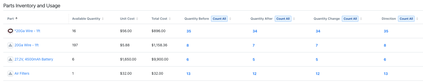
A table report listing parts inventory and usage details -
Graph Reports: provide visual summaries of your data in the following formats:
-
Bar Chart: shows your data using bars and segments to compare quantities across groups.
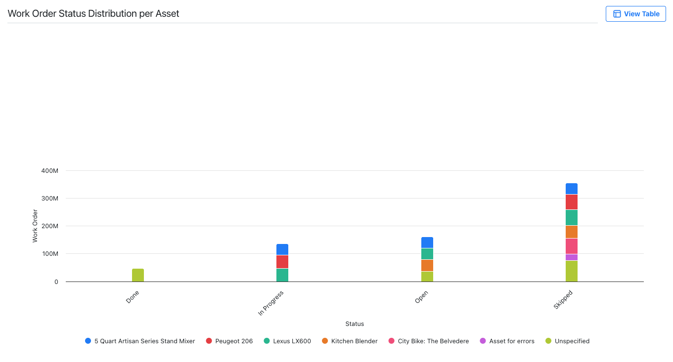
A bar chart displaying the distribution of work order statuses for different assets -
Line Chart: shows trends or changes over time by connecting data points with lines.
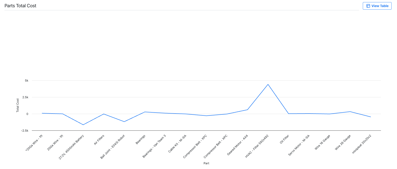
A line chart showing the total cost for various parts -
Pie Chart: shows data as slices of a circle to illustrate part-to-whole relationships.
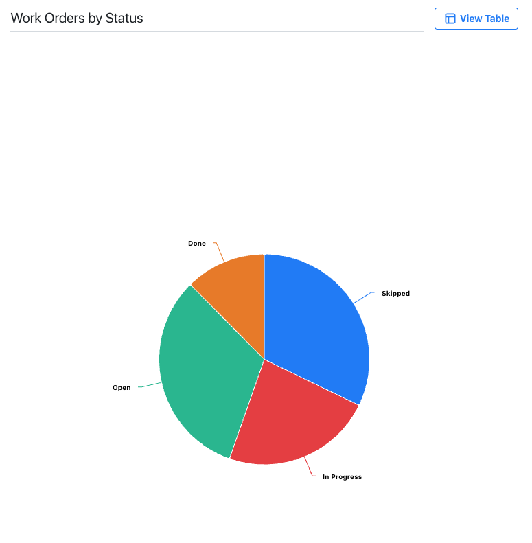
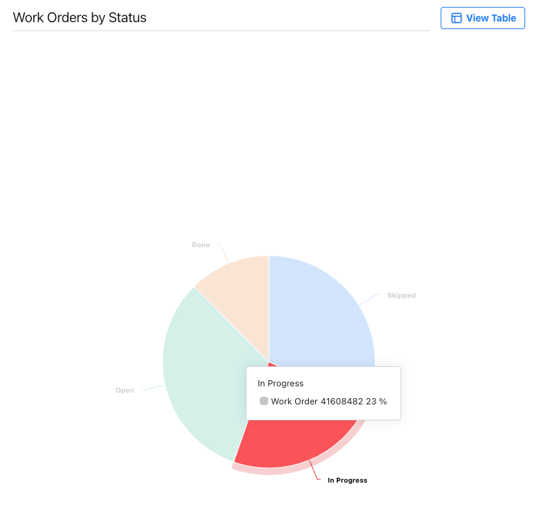
-
For details, see Graph Report.
Visualization Options
After you select a visualization type, you need to tailor the report to focus on the data you want to analyze. The available options depend on the type of visualization you select.
| Visualization Type | Options |
|---|---|
| Table | Aggregation: Select an aggregation to refine the data in your report. |
| Graph: Bar, Line |
|
| Graph: Pie |
|
Aggregations
Aggregations summarize multiple values into a single output to reduce the amount of information displayed in a report. You can use an aggregation like Count, Sum, or Average on your dataset fields to refine how your data is presented.
Primary dataset fields don’t require aggregations, but using one might affect how your data is grouped and displayed.
| Aggregation Type | Description |
|---|---|
| Average | Calculates the mean of all values. For example, if you have three transactions of 5, 10, and 15 parts, the average will be 10. |
| Count (All) | Counts the number of related values. If a part is linked to 5 transactions, the reported value is 5. |
| Count (Unique) | Counts the number of distinct values. If part is used in 3 work orders, 1 time in the first one, 4 times in the second one, and 7 times in the third one, the reported value is 3. |
| Maximum | Gives the largest value. |
| Minimum | Gives the smallest value. |
| Summation | Adds up numeric values from related data. |
You can select an aggregated value to view the underlying source values that were combined, providing more detailed insight into the reported figure.
Date Grouping
The Group By option allows you to group dates by periods: Day, Week, Month, or Year. This option is available for all date columns in Report Builder.
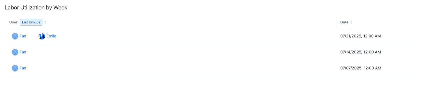
Let's say you want to build a report focused on labor utilization, and group the data by week.
| Dataset | Columns |
|---|---|
| Labor Utilization by Day |
|
- Setting a List (Unique) aggregation on the User column adds one line per user.
- Setting the Group By option to Week groups every occurrence of the user's labor utilization by week, more specifically by the first day of each week at 12:00 AM.
Filter Conditions
Filter conditions determine what makes the selected column in your report match the filter.
| Condition | Description |
|---|---|
| Contains | Finds entities that contain the selected value. |
| Does not contain | Finds entities that don't contain the selected value. |
| Is above | Finds entities that have a greater numeric value than the one selected. |
| Is above or equal to | Finds entities that have an equal or greater numeric value than the one selected. |
| Is below | Finds entities that have a smaller numeric value than the one selected. |
| Is below or equal to | Finds entities that have an equal or smaller numeric value than the one selected. |
| Is between | Finds entities that have a date value within a specific range. |
| Is empty | Finds entities where the filter field has no value at all. |
| Is equal to | Finds entities that match the selected value. |
| Is none of | Finds all entities not specified in the filter settings. |
| Is not empty | Finds entities where the filter field has any value. |
| Is not equal to | Finds entities that have a different value than the one selected. |
| Is one of | Finds entities where the filter field matches one or more values that you specify. Use this to include specific entities in the view. |
Requirements and Limitations
Report Builder and its extended capabilities (e.g. Report Builder AI and Global Reprot Builder) are subjected to functional limitation that may impact how data is filtered, calculated, or presented. For details, see Report Builder Limitations.
Report Builder AI
Report Builder AI can generate custom reports from a simple prompt, eliminating the need to manually select datasets, filters, or visualizations. Describe the information you want and the AI engine builds the report for you.
AI-generated reports may include errors. Make sure to review the report's content before sharing.
Guidelines for Writing Effective Report Prompts
To help AI generate a report, you need to:
-
Use natural language, as if you were interacting with a person.
-
Use direct prompts. Ask clear questions or provide precise instructions to communicate your intent. For details, see How to Write Direct Prompts.
-
Clearly state your goal. For example:
- What information are you looking for?
- Which entity do you want to get data from?
- Which visualization type would you like to use (e.g., bar chart, line chart, pie chart, or table)?
How to Write Direct Prompts
Direct prompts are direct questions or precise instructions that provide clear guidance and intent. You don't need to give additional context or examples. Simply write what you want and MaintainX will generate a custom report.
| Use Case | Direct Prompt Example |
|---|---|
| Cost tracking | Show parts usage cost by category in a pie chart. |
| Asset performance | Show downtime by asset over the past 90 days. |
| Workload analysis | Show employee time contributions by date. |
You can also prompt the AI engine to search for specific entities, such as:
- Asset
- Downtime Reason
- Part
- Location
- Work order categories
- User
- Team
- Organization (available only for global organizations). For details, see Global Report Builder.
This allows you to filter your data based on these entities.
For example, you can use the prompt Show the work orders for location Warehouse C. The AI engine automatically applies a location filter for Warehouse C.
Always explicitly name the entity in your prompt.
For example, use Show work orders created by Clint E. instead of Show work orders created by me.
Prompt Validation Safeguards
The AI engine includes safeguards that evaluate whether a prompt falls within the scope of Report Builder AI. It classifies prompts into three categories:
| Category | Description | Prompt Example | Workaround |
|---|---|---|---|
| Irrelevant | Prompts unrelated to reporting. | Dinner ideas. | Not applicable. |
| Ambiguous | Prompts related to reporting but missing key information. | Work orders for this location. | Show work orders for the London warehouse this month. |
| Out of scope | Prompts related to functionality not supported by Report Builder AI. | Build a MTTR report. | You can find it automatically generated in the Asset Health tab. For details, see MTBF-MTTR Report. |
Global Report Builder
If you have a Global Organization, you can build global custom reports to analyze data across all your sub-organizations, compare key metrics, and share insights with your team.
- For details, see Build a Global Custom Report.
- For more information about Global Organizations, see About Global Organizations.
Building a global custom report is identical to building a custom report for a single sub-organization. The only difference is the Organization column, which appears when you create a global custom report.
You can:
- Apply filters to choose which sub-organizations to include in your report.
- Access and analyze the selected sub-organizations' combined data.
When you build a global custom report, you can add entities (e.g. work orders, parts) that belong to a sub-organization. If you have sufficient permission to view the sub-organization's entities, you can select an entity from the Preview panel to view its details. Otherwise, you won't be able to access it and view its details.